Understand Your Sales For Better Planning
The most significant benefit of Defog is that it integrates Amazon Seller Central’s data with Google Sheets. Sellers may then use the data to do many things, like plotting where their orders are delivered in the US.
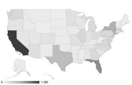
In this article, we will show you how to create a chart with the US map on a color scale from the states where you sell less to the states where you sell the most. In the end, your geo map will look similar to this one:
You may also use the principle illustrated in this post to create other maps comparing order volumes to the countries in North America, Europe, or the whole world.
The map will also be automatically updated as soon as Defog updates the data.
Step 1: On your desktop browser, open your Defog spreadsheet on the OrdersTable tab.
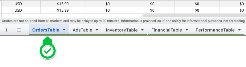
Image 1 – Open Defog on the OrdersTable tab
Step 2: Start by selecting the initial column of your pivot table. Click on the Column V.
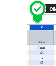
Image 2 – Click column V
Step 3: Now select the final column of your pivot table. Shift-click on Column X. You have selected all rows between Column V and X, including the ones that will be added in future updates to the OrdersTable.
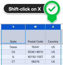
Image 3 – Shift-click column X
Number of orders per US State
Step 4: With the table selected in the previous steps, click Insert on the top Google Sheets menu and then click Pivot table (image 4.1). Then click Create in the pop-up window (Image 4.2). You will create a new tab on your Defog that will look like Image 4.3 below.
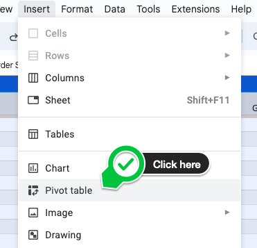
Image 4.1 – Click Insert > Pivot table
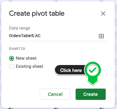
Image 4.2 – Create a pivot table on a new sheet
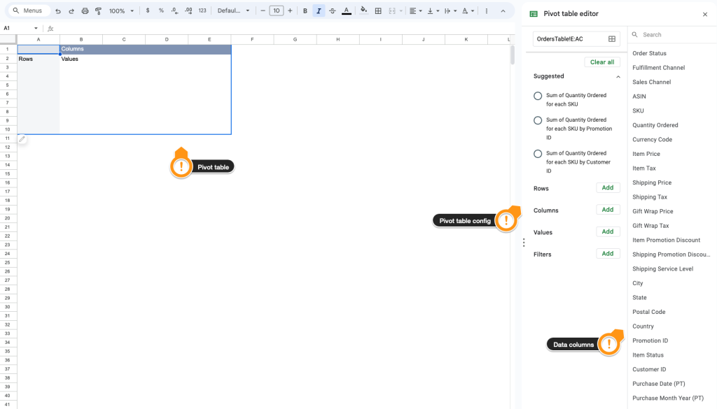
Image 4.3 – Your new pivot table
Step 5: Now is the time to populate your pivot table with the desired data. Let’s start by selecting the State. First, click State on the data columns to the right of the tab.

Image 5 – Click on State
Step 6: Drag and drop the State column to the area below the session Rows on the pivot table configuration column (image 6).
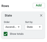
Image 6 – State under Rows
Step 7: To select the pivot table values. Use the exact drag-and-drop mechanics above. Drop the States below Values. Observe the Summarize by the pull-down menu. The formula used by it is COUNTA. COUNT will count the number of times (number of orders) a state appears on rows.
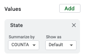
Image 7 – State on Values
Step 8: Drag and drop the State column below the session Filters on the pivot table configuration column. Next, on the State box on Filters, click on Status > Filter by condition and then on Custom formula is (the last option at the bottom of the menu). Copy and paste the following formula in the blank text box and click OK (Image 8).
=len(State)=2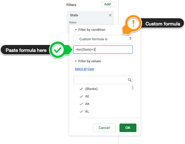
Image 8 – State on the Filters session
Why do we recommend using this formula? Customers write what they want in the State field for the order delivery address on Amazon, so most of the time, you will see New York as NY, but sometimes it is New York, and other times, N.Y or N.Y. To remove these less common ways of writing the states’ abbreviation, we filter out every value that is not 2 characters long.
Step 9: Unselect the option Show totals on the State box under Rows. Then, on the pull-down menu Order, select Descending, and on the pull-down Sort by, select COUNTA of State (Image 9.1)
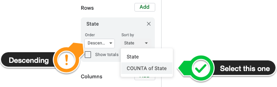
Image 9.1 – Configure State on Rows session
In Image 9.2, we show the final pivot table configuration:
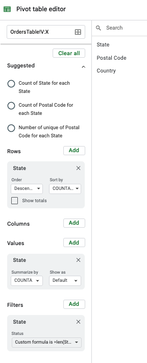
Image 9.2 – Pivot table configuration
The pivot table will look like this:
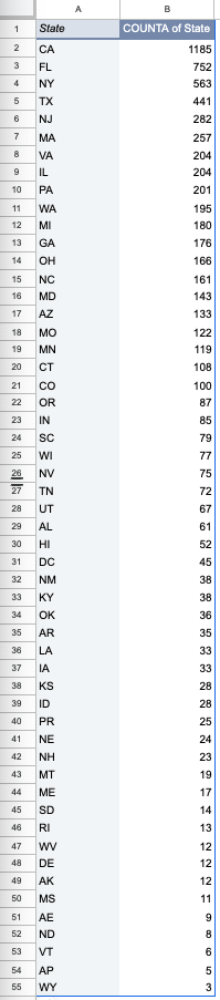
Image 9.3 – The pivot table
The geo chart
Step 10: Select the pivot table and click Insert > Chart (Image 10.1). Google Sheets will then create a pie chart. On the Chart editor (sidebar on the right that appears every time you are creating or editing a chart), click on the Chart type, then choose Geo chart (Image 10.2)
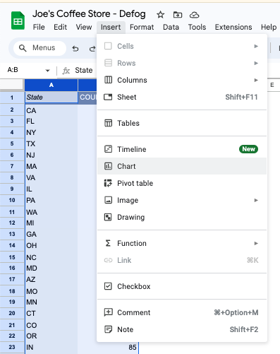
Image 10.1 – Create the chart
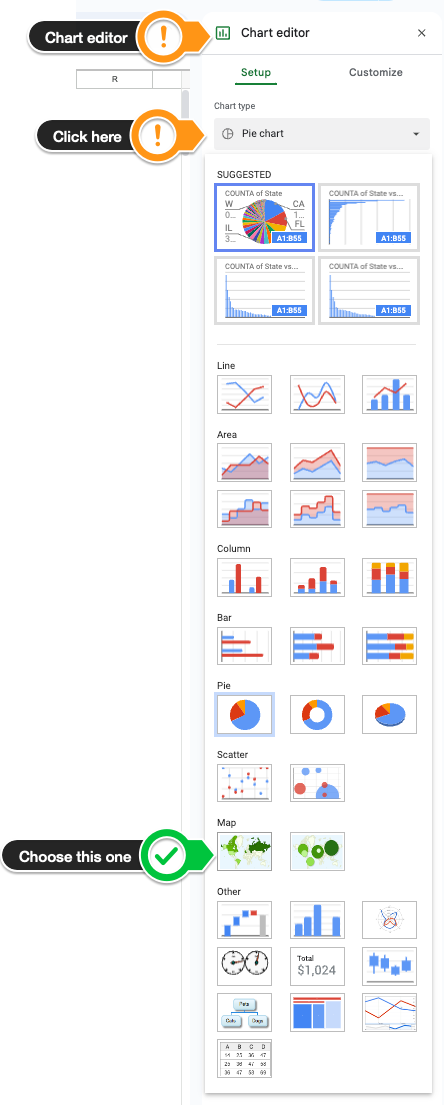
Image 10.2 – Choose Geo chart
Step 11: Still on the Chart editor, click on Customize, then click on Geo to see the options. On the Region pull-down menu, choose the United States. For Min, choose a light gray color (or another of your preference). For Max, choose a dark gray, and for Mid, choose a color in the gray scale between the one you chose for Min and Max.
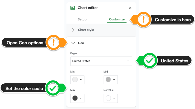
Image 11 – Configuring the Geo chart
Done! Your geo chart is ready and looks like this:
If you want to learn what a particular column stands for on Defog’s tables, please visit our glossary.
Thank you for reading this post. If you still haven’t used Defog, use it for free here.
If you need any help, we are here for you.
Disclaimer: Defog is not responsible for any decisions made by the reader of this post regarding the data, formulas, and visuals provided.