Compare Best-Selling Products’ Average Number of Units Sold Between Various Periods
The most significant benefit of Defog is that it connects to Amazon Seller Central, automatically retrieving valuable data to Google Sheets. Sellers may then use the data to monitor how their best sellers sell on average throughout different periods.
This article will show you how to create an interactive dashboard to calculate the average units sold in different periods. You can then easily change the period you want to monitor. With little formula editing, you may use the same principle to compare other metrics, like the average sales amount, sales from advertising per campaign, etc.
You will create a table like the one below using conditional formatting to highlight which best-selling SKUs are selling less in the most recent period compared with the previous period:
One good thing about doing this in Defog’s spreadsheet is that the table we create will automatically update as soon as Defog updates the data. Additionally, we will use today’s date as the base for all periods; therefore, the periods will be automatically recalculated every day you open the spreadsheet (this is what data analysts call the moving average).
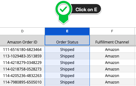
Step 1: On your desktop browser, open your Defog spreadsheet on the OrdersTable tab.
Step 2: Start by selecting the initial column of your pivot table. Click on the Column E.
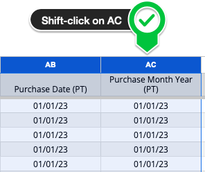
Step 3: Now select the final column of your pivot table. Shift-click on Column AC. You have selected all rows between Column E and AC, including the ones that will be added in future updates to the OrdersTable.
Your Best Sellers
To calculate your best sellers, we will create a simple table with the percentage of sales per SKU (share of sales) in the last 60 days. Then, we will filter only products that sell more than 5% of total sales. Of course, you may change the 60-day period and total sales percentage (5%) to your particular case.
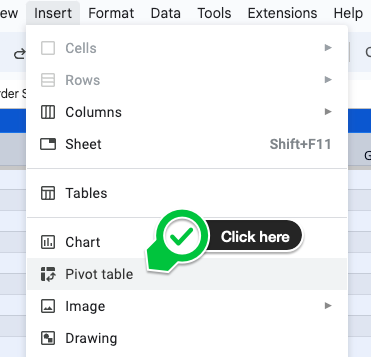
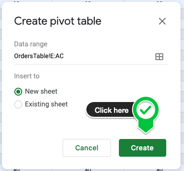
Step 4: With the table selected in the previous steps, click Insert on the top Google Sheets menu and then click Pivot table (first image below). Then click Create in the pop-up window (second image below). You will create a new tab on your Defog that will look like the third image below.
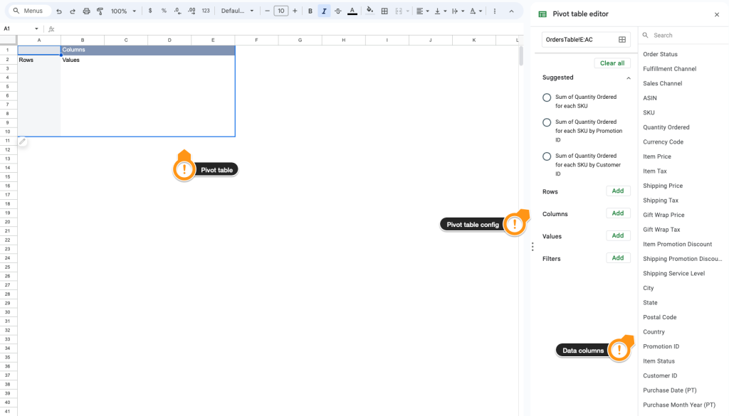
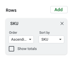
Step 5: Now is the time to populate your pivot table with the desired data. Start by selecting the SKU. First, click SKU on the data columns to the right of the tab.

Step 6: Drag and drop the SKU data column to the area below the session Rows on the pivot table configuration column. On the new SKU box, unselect the option Show totals. All SKUs will appear in the first column on your pivot table.
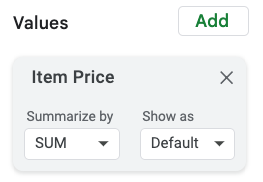
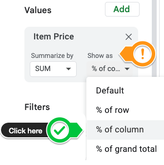
Step 7: Use the drag-and-drop mechanics above to select the pivot table values. Drag the Item Price (the sales amount per order) data column below Values (first image below). Then, change the Show as pulldown menu to % of column (second image below).
Step 8: Let’s set the period for the last 60 days. Drag and drop the Purchase Date (PT) data column below the session Filters on the pivot table configuration column. Next, on the Purchase Date (PT) box on Filters, click on Status > Filter by condition and then on Custom formula is (the last option at the bottom of the menu). Copy and paste the following formula in the blank text box and click OK.
='Purchase Date (PT)' >= (today()-60)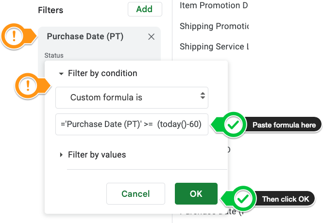
Note that the column on your newly created pivot table shows all sales shares, in percentages, per SKU. Of course, the column sums 100%, and it is filtered to include sales only in the last 60 days.
Step 9: Add the heading “Sales share > 5%” next to column C, just to the right of your pivot table, and copy the following formula to C2:
=ARRAYFORMULA(if(B2:B<>"",if(B2:B>0.05,"Yes",""),""))In the end, you will have a table like the one below:
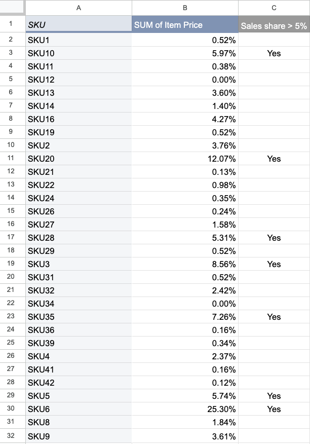
Note the “Yes” values are only next to the products with shares of sales equal to or over 5%.
Defining the Periods
Step 10: Skip a column and add the following headings to your sheet.
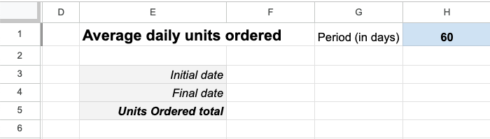
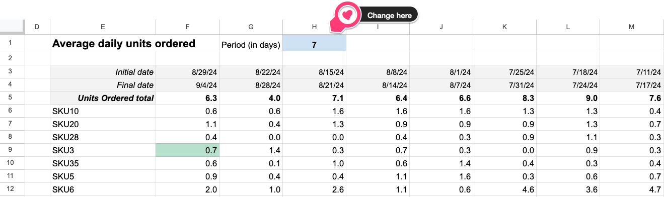
Note that H1 is a number you can set with the desired period in days. Say you want to see just one week; add 7 to H1. If you’re going to track the 30-day period, add 30.
Now, on E6, right below the heading Units Ordered total, copy and paste the following formula:
=filter(A2:A,C2:C="Yes")Only the best sellers (share >= 5%) SKUs will be listed from E6. Neat!
Now, on F3, copy and paste the following formula:
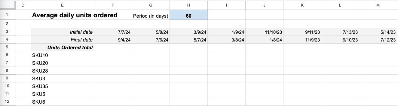
=F4-($H$1-1)Now select and drag the formula in F3 up to M3.
On F4, copy and paste:
=today()-1And on G4, copy and paste:
=F4-$H$1Now select and drag the formula in G4 up to M4.
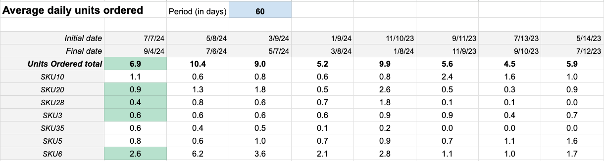
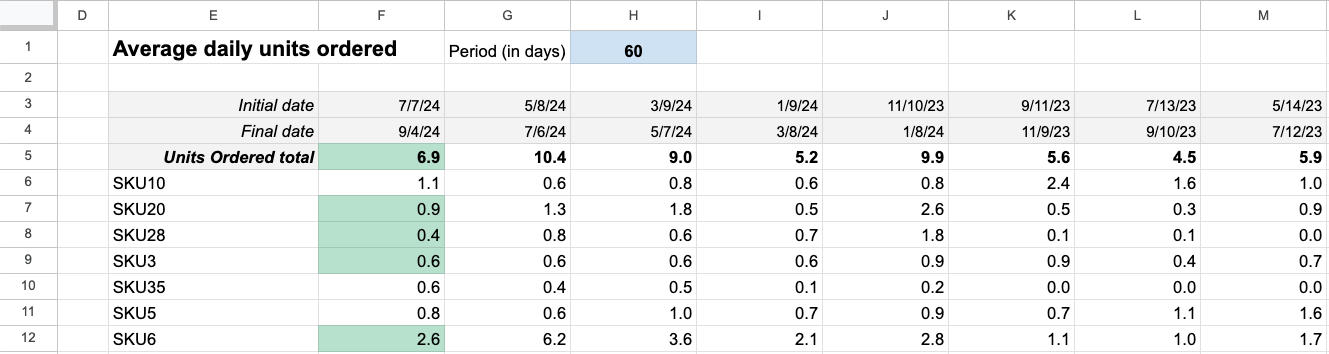
If you left H1 with 60, as shown above, you now have the eight most recent 60-day past periods ending yesterday (F3-F4 has the most recent 60-day period). Your table should look similar to the one below:
Units Sold Moving Average
Step 11: Copy and paste the following formulas to the cells indicated below:
On F6: Add a formula that sums the number of units ordered for a particular SKU in the period between and including the dates in F3 and F4.
=BYROW($E6:$E,LAMBDA(row,if(row<>"",sumifs(OrdersTable!$J:$J,OrdersTable!$I:$I,"="&row,OrdersTable!$AB:$AB,">="&F$3,OrdersTable!$AB:$AB,"<="&F$4)/$H$1,"")))Now, select and drag the formula on F6 up to M6.
On F5: Sum the best seller’s total number of units sold in the period:
=sum(F6:F)Now select and drag the F5 formula up to M5.
Step 12: To do the conditional formatting and highlight the units sold less than the previous period, select column F, then click on Format > Conditional formatting.
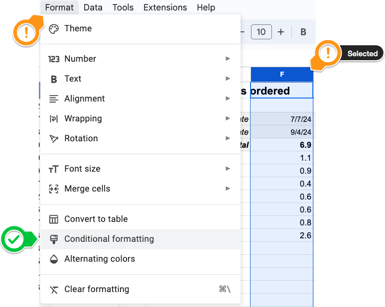
On Format rules, select Custom formula. Add the formula below to the blank box and adjust the Apply to range option to F5:F.
=F5<G5
Your final table will look like the one below.
And if you change the period to 7 days on cell H1:
Please note that if you sell in more than one country in the same Amazon Region (North America, Europe, or Far East), Defog will download data from all countries (all marketplaces) to the same OrdersTable. You must do this moving average sales amount analysis per country or currency, as you cannot sum the total sales amount in different currencies to calculate the best-selling products.
One issue with the table above is that the conditional formatting will highlight every product that sold less in the most recent period than in the previous one, even if the difference is 0.01, which is probably irrelevant. Moreover, comparing only two periods is weak—a comparison against a trend is much more significant. Another issue is that if you have a lot of SKUs selling above the minimum quantity to qualify as best-selling products, your table may be overcrowded with highlights, impacting your attention to what is relevant.
This article shows a better way to alert for relevant changes using a popular statistic called standard deviation.
If you want to learn what a particular column stands for on Defog’s tables, please visit our glossary.
Thank you for reading this post. If you still haven’t used Defog, you can do so for free here.
If you need any help, we are here for you.
Disclaimer: Defog is not responsible for any decisions made by the reader of this post or for the consequences of using the data, formulas, and charts provided.