As e-commerce sellers, we deal with many numbers, statistics, and metrics. Sometimes, too many of those figures are around, which is stressful and messes things up, impacting our ability to determine what is important and deserves attention and reaction. This article will show you how to create a simple panel highlighting only relevant sales information.
Unexpected behavior indicator for your sales
The most significant benefit of Defog is that it integrates with Amazon Seller Central, automatically retrieving and updating valuable data to Google Sheets. Sellers may then use the data to monitor their orders per SKU and quickly spot abnormal behaviors.
In this article, we will use the table created in the article on average daily units sold, adding a statistic indicator to monitor uncommon behavior. With little formula editing, you may use the same principle to track other metrics against unexpected behaviors, like the average total sales amount, sales from advertising, conversion rates, etc.
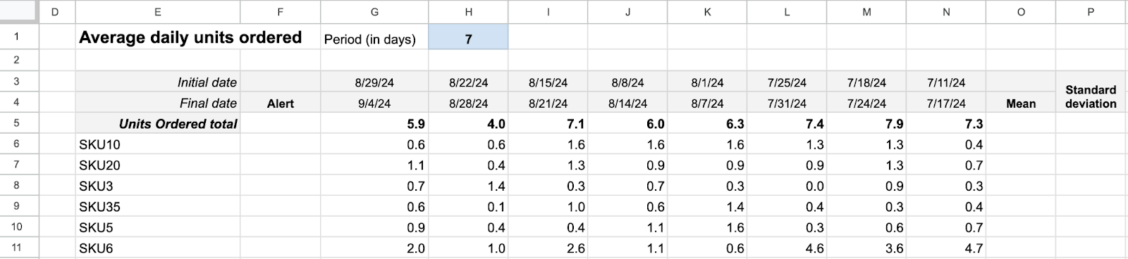
You will create a table like the one below using conditional formatting to highlight which SKUs are showing unusual behaviors:

One good thing about doing this in Defog’s spreadsheet is that the panel will be automatically updated as soon as Defog updates the data. Additionally, we will use today’s date as the base for all periods; therefore, the periods will be automatically recalculated every day you open the spreadsheet.
One issue with the table created in the previous article about the average daily units sold is that the conditional formatting will highlight every product that sold less in the most recent period than in the previous one, even if the difference is 0.01, which is probably irrelevant. Moreover, comparing only two periods is weak – a comparison against a trend is much more significant. Another issue is if you have a lot of SKUs selling above the minimum quantity, your table may be overcrowded with highlights, impacting the attention to what is relevant.
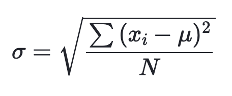
A better way to track one indicator’s unexpected behavior is to use the standard deviation, which measures the spread of the data relative to its mean.
We use a simple formula to subtract the average of previous values from the most recent period value (let’s call it deviation). If the deviation is above one standard deviation, we highlight it; otherwise, we consider it normal. You will see how. Let’s do this.
Step 1: We will continue where we finished the article on average daily units sold. Start by removing the conditional formatting added in Step 12 of that article. Select column F, click on Format > Conditional formatting, then click on the trash can icon next to the column format.

Step 2: Add one column before the most recent period and write the heading Alert on row 4 (Column F). Then, write the headings Mean and Standard deviation on row 4 in the first two blank columns (Columns O and P) to the right of your table. In the end, you will have something like this:
The standard deviation
Step 3: We use the formula below over the seven previous periods to calculate the standard deviation.
Source: Khan Academy
To do that, first, we calculate the mean by adding the formula below to the cell O5:
=arrayformula(if(E5:E<>"",(H5:H+I5:I+J5:J+K5:K+L5:L+M5:M+N5:N)/7,""))Then we add the standard deviation formula to the cell P5:
=arrayformula(if(E5:E<>"",SQRT(((H5:H-R5:R)^2+(I5:I-R5:R)^2+(J5:J-R5:R)^2+(K5:K-R5:R)^2+(L5:L-R5:R)^2+(M5:M-R5:R)^2+(N5:N-R5:R)^2)/7),""))Alerts for unexpected values
Step 4: We will consider an unusual value if the deviation exceeds one standard deviation.
To do this calculation, add the following formula to the cell F5:
=arrayformula(if(E5:E<>"",if((G5:G-O5:O)>P5:P,"+",if((G5:G-O5:O)<-P5:P,"-","")),""))Step 5: Let’s use conditional formatting to highlight the alerts.
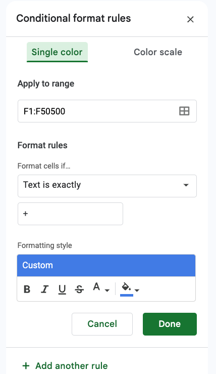
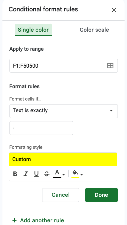
Select the column F and click on Format > Conditional formatting, then create two rules, one that will paint the cell background blue (when it is +) and the other that will paint the cell background yellow (when it is –), like the images below:
With some cosmetics improvements and for 14-day periods, our table will look like the one below:
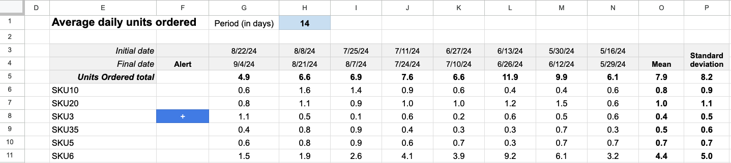
You can change the Period (in days) on cell H1 to analyze a different period, like one day, 30 days, etc. The alerts will show only the SKUs with relevant changes in the most recent period, compared to the previous 7-period trend.
If you want to learn what a particular column stands for on Defog’s tables, please visit our glossary.
Thank you for reading this post. If you still haven’t used Defog, you can do so for free here.
If you need any help, we are here for you.
Disclaimer: Defog is not responsible for any decisions made by the reader of this post or for the consequences of using the data, formulas, and charts provided.