Artificial Intelligence (AI) is transforming businesses across various industries. For Amazon sellers, identifying sales trends, understanding customer preferences, and forecasting future demand can significantly enhance their business performance. However, for AI to provide accurate and valuable insights, it depends on two key factors: a well-designed AI model and high-quality data.
AI models are only as good as the data they are fed.
In e-commerce, sellers manage various data sources, including organic sales, advertising performance, inventory management, and financial operations. It is crucial to clean and sanitize this data before using it to train an AI model. This process involves removing unnecessary information, correcting errors, and ensuring consistency in the data format. Additionally, AI models for transactional data perform best when they receive well-structured data. This means organizing the data in a clear, consistent, and logical format that the AI can easily understand and process.
This article presents compelling examples of successful AI-powered analysis, leveraging the pristine data sourced from Defog. All the examples below use the model 4o mini from ChatGPT, OpenAI.
First, we must learn how to connect Google Drive with ChatGPT and upload a Defog. Follow along.
ChatGPT – Setting Up Google Sheets Integration
To facilitate the data upload from Defog to ChatGPT, we suggest you connect your ChatGPT to Google Drive. Here is how to set up this integration. Start by clicking on the paper clip icon and then click on Connect to Google Drive (see images below):


Follow the login and authorization process presented by Google Drive. Then, you can upload data from Google Drive to ChatGPT.
ChatGPT – Upload Your Defog from Google Drive
Now that you have connected your Google Drive with ChatGPT, click on the paper clip icon again and then click Add from Google Drive.

Choose your Defog on Google Drive. In this example, we will use a Defog named “Joe’s Coffee – Defog.”

Customer Profile
Your Detailed Consumer Profile Is Here
Sellers can significantly benefit from understanding their customers’ profiles and behaviors. By gathering information about them and how they shop, such as which products were purchased together, sellers can tailor their offerings to meet customer needs.
I need help analyzing the OrdersTable and the FinancialTable worksheets. Your goal is to create a table with a detailed customer profile analysis. Each row on the table will have one customer ID. The columns with values should appear in the following order: 1. customer's country, 2. State, 3. City, 4. Number of orders, 5. Units ordered, 6. Spent amount (note that the Item Price column stores the amount paid by the consumer for the order), 7. Number of refunded orders, 8. List of SKUs purchased, 9. First SKU purchased, and 10. Last purchase date. The refund orders are in the FinancialTable under the Event "Refund - Principal". Please plot the table sorted by the number of orders descending for the top 30 customers.
Which Products Attract More New Customers
Understanding which SKUs attract the most new customers can be precious for Amazon sellers. Analyzing customer purchases and identifying which SKUs bring in the most new customers can inform marketing and inventory strategies.
I need help analyzing the OrdersTable worksheet to learn which SKUs attract more new customers. The goal is to generate a histogram chart showing the percentage of the total number of unique customers who purchased the same first SKU. For example, 70% of customers bought SKU 2 first, 8% bought SKU 4 first, etc. Please create the chart. Sort the chart by the descending order of customer percentage. Show only the top 10 SKUs that attracted more new customers.
Discover How Customers Are Ordering In Your Store
Amazon sellers benefit from knowing how customers behave and plan based on that information. One cool thing to learn is the percentage of customers who purchase one single order rather than multiple orders.
I need help analyzing the OrdersTable worksheet. The goal is to generate a histogram chart showing the percentage of the total number of unique customers who purchased the same range of orders. For example, 70% of customers bought just once, 8% bought between 6 and 10 orders, etc. Please create the chart for the following order ranges: 1, 2, 3, 4 to 5, 6 to 10, and more than 10. Sort the chart by the number of orders in ascending order.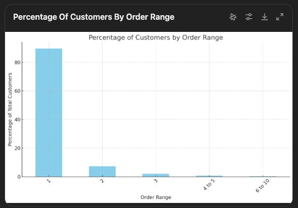
Which Product Combinations Do You Sell The Most?
Examining all orders to find popular product combinations can guide retailers in offering bundles that may increase sales and customer loyalty. This article explores a method to identify top-selling product combinations.
I need help analyzing the OrdersTable worksheet. The goal is to generate a table with two columns: one is the list of unique combinations of SKUs purchased by customers and the other one is the count of customers who purchased each combination - the order in which a customer bought two or more SKUs does not matter - meaning "SKU2, SKU10" is the same as "SKU10, SKU2". Please create the table as described without single SKUs; we are only interested in customers who have bought more than one different SKU. Sort the final table by the number of customers in descending order.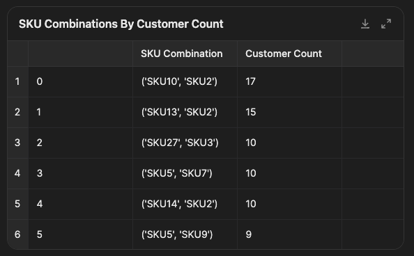
See How Many Units Your Customers Are Buying
Understanding customer ordering behavior, such as the number of units purchased, helps businesses tailor their product availability and pricing. Companies can optimize stock levels and marketing efforts by identifying key quantity ranges.
I need help analyzing the OrdersTable worksheet. The goal is to generate a histogram chart showing the percentage of the number of unique customers who purchased the same range of units. For example, 70% of customers bought just one unit, 8% bought between 6 and 10 units, etc. Please create the chart for the following ranges: 1, 2, 3, 4 to 5, 6 to 10, and more than 10. Sort the chart by the ranges in ascending order.
Discover How Customers Are Spending In Your Store
Businesses benefit from knowing who their customers are and plan based on that information. One cool thing to learn about customers is how they fall into different spending brackets, which can inform pricing and promotional strategies.
I need help analyzing the OrdersTable worksheet. The goal is to generate a histogram chart showing the percentage of the number of unique customers who spent the same range of amounts. For example, 70% of customers spent less than $10, 8% spent between $50 and $100, etc. Please create the chart for the following ranges: < $10, >= $10 < $25, >= $25 < $50, >= $50 < $100, >= $100 < $150, >= $150 < $200, >= 200 < $250, >= 250 < $300, >= $300. Sort the chart by the ranges in ascending order.
Understand Your Customers’ Behavior: Repeat Customers
Understanding repeat customer behavior aids in tailoring marketing strategies and improving customer retention.
I need help analyzing the OrdersTable worksheet to learn the percentage of orders per SKU from customers who bought the SKU once before. The goal is to generate a table with all the SKUs, one SKU per row, with the total number of unique orders for that SKU, the number of orders from unique customers, and the number of orders from repetitive customers who bought the SKU more than once (total number of orders minus the number of orders from unique customers), and the percent of these orders from the repetitive customers over the total number of unique orders for that SKU. Sort the table by the percentage column in descending order. Note that some orders have more than one row in OrdersTable, so to calculate the number of unique orders, we must calculate only unique Order IDs round the percent to the nearest whole numbers. Ignore orders with no Customer ID.
Sales
Discover the Most Popular Categories
Monitoring product sales by category over time allows sellers to identify trends and make informed decisions, like which categories need promotions or are not worth selling.
Please note that the prompt below needs a category column in the OrdersTable. To learn how to add it, please visit this post.
I need help analyzing the OrdersTable worksheet. The goal is to generate a table like this: each row is dedicated to one product Category, and the columns should have units purchased in each Category by the orders' month/year. Please create the table as described from June 2024 up to August 2024. Sort the final table columns by the month/year in ascending order. Show the number of units ordered per month in the last row (total row) and the number of units ordered per category in the last column (total column).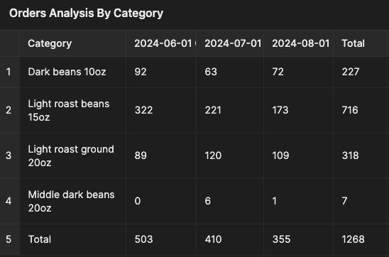
Track your refunds per SKU
Tracking refunds per SKU helps improve products and listings and reduce return rates.
I need help analyzing the FinancialTable worksheet. The goal is to generate two tables. Table1 showing a list of SKUs and the monthly units refunded for each SKU, Table2 showing a list of SKUs and the monthly amount refunded for each SKU. The number and amount of refunded units can be found in the rows with the "Refund - Principal" event. Please create the tables for the most recent 4 months of data. Do not add SKUs with zero refunds in the period, and if the refunded number is zero in a month, show a blank space. Finish the tables with totals per column and row.

Compare the units sold for your best-selling products between different periods
Comparing units sold across periods helps you understand the impact of competition or the seasonal behavior of your best-selling products.
I need help analyzing the OrdersTable worksheet. The goal is to generate a table showing the average units ordered per day per SKU for the most recent 8 periods of 15 days in the worksheet. Ignore the most recent day in the worksheet in all calculations. Use the column "Purchase Date (PT)" to calculate dates. Using all data in the worksheet, filter the list of SKUs to show only top-seller SKUs, i.e., SKUs that sell 5% or more of the total units sold in this store. Finish the tables with the totals per column. The total is the sum of values for the column. Sort the table from the most recent period to the least recent period. Including the total row, round all values to show only one decimal number. The title row must show the periods in the following format: from date (month/day/year) to date (month/day/year), like "from 8/21/24 to 9/4/24." As today is 9/5/24, the most recent period is from 8/21/24 to 9/4/24, the next period is from 8/6/24 to 8/20/24 and so on.
How does your store’s average sales change across different periods?
Analyzing average sales over various periods provides insights into sales trends, growth, or decline.
I need help analyzing the OrdersTable worksheet. The goal is to generate three tables and one chart showing the average daily sales amounts for three periods. Each period will have a table: one-day, 7-day, and 28-day periods. Each table should have three rows: the title row showing the periods, the average daily sales amount row, and one row that shows the percentage change between consecutive periods. Important: the percent change is from the perspective of the most recent period. For example, if the most recent period average daily sales is USD 20 and its predecessor was USD 10, the percent should show +100% in the most recent period column, and so on, comparing two consecutive periods. All periods should end on the same date. As today is 9/5/24, all tables should end at 9/4/24, ignoring the current 9/5/24. Use the column "Purchase Date (PT)" to calculate dates and the column "Item Price" to calculate the sales amount. Sort the tables from the most recent period to the least recent period and show only the most recent 8 periods. The title row must show the periods in the following format: a) for the table analyzing one day (month/day/year); b) for the other tables: from date (month/day/year) to date (month/day/year). For example, for the 7-day table, the title says, "from 8/29/24 to 9/4/24." As today is 9/5/24, the most recent day is 9/4/24, and the most recent period for the 7-day table is "from 8/29/24 to 9/4/24", the next period is "from 8/22/24 to 8/28/24", and so on. The chart should be a line chart showing the average sales amount per day for the 28-day table, with the periods as the x-axis and the average sales per day as the y-axis. Please add labels to the chart line with the percent change in the corresponding period. Round average daily sales amount and percentages to 2 decimal places only. Show the x-axis from the least recent period to the most recent.


GEO Sales
See Your Amazon Store Sales per State in a Geo-Chart.
You may, of course, edit the prompt below to analyze other geographies.
I need help analyzing the OrdersTable worksheet. The goal is to generate a table with the US States and the number of orders purchased in each State. Use the worksheet column "State" to determine the State where the order was purchased. Add up the most common ways of writing a State, for example, California is the same as CA, New York is the same as NY, and so on. Add all 50 US States to the final table. Sort the table using the number of orders column in descending order.
Now, let’s plot a Geo-chart for this table.
Create a simplified approximation geo map with the US States using shades of gray to represent the volume of sales in each State. Show all 50 States.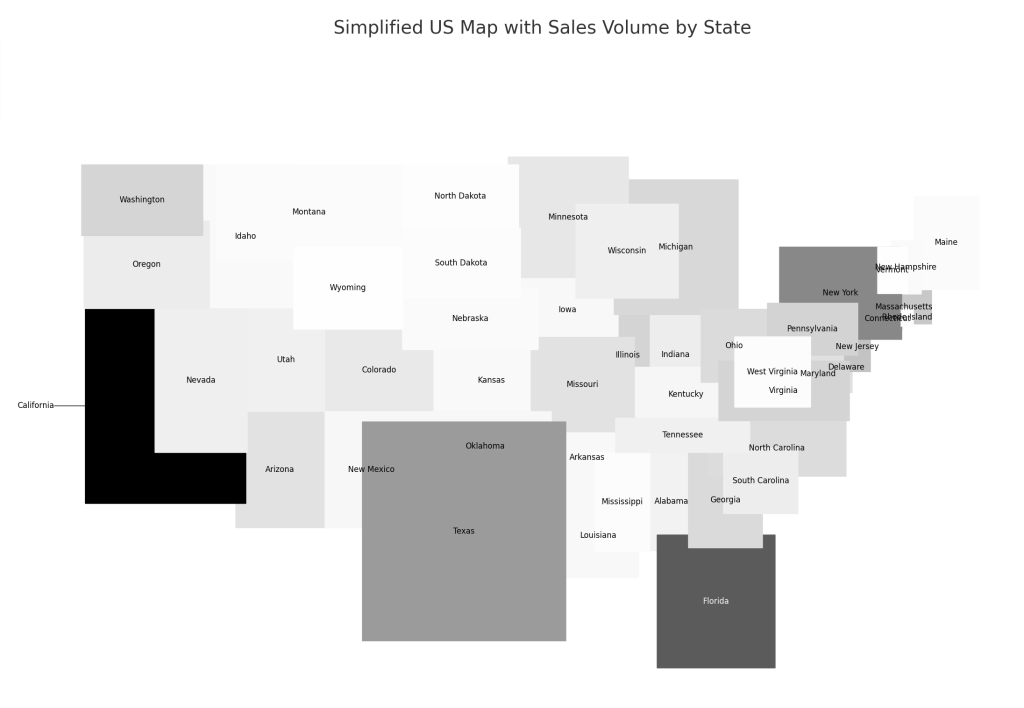
Advertising
Analyze Ad Sales vs. Organic Sales to Optimize Your Strategy
Compare ad-driven and organic sales over a selected period, enabling better decision-making.
I need help analyzing advertising sales compared with organic sales per month. Organic sales are total sales minus advertising sales. Total sales on the OrdersTable are in the Item Price column, and sales from advertising are in the AdsTable Sales column. For the OrdersTable, only use US orders (Amazon.com in Sales Channel). Please show the total, organic, and ad sales in a table with months as rows. You will show only three months in the result. If the most recent month is incomplete, do not show it in the final result; instead, show the previous three months. Present the months in ascending order. After you present the table, create a 100% horizontal stacked bar chart with months on the y-axis and percentages of the total sales on the x-axis. Use red for ad sales and blue for organic sales. Show the red bars first, then the blue bars. For the month axis, show only the month number and the year.
Measure New vs. Returning Customers in PPC Campaigns
Analyzing whether advertising investment brings in new customers or encourages repeat purchases is key to optimizing your PPC strategy. (This prompt only works with Defog Advertising).
Analyze my Amazon PPC campaign data to determine the percentage of ad-driven purchases from new customers vs. returning customers. Use only CampaignSB and CampaignSD worksheets' column 'New-To-Brand Purchases' to calculate the number of new-to-brand customers. Use the column 'Purchases' also from CampaignSB and CampaignSD to calculate the total number of purchases. Compare new vs. returning customers per campaign type (SB and SD) and generate a bar chart to visualize the breakdown for the two types of campaigns. Also, calculate and display the percentage of new vs. returning customers on the chart.
Performance
Uncover Seasonal Insights Comparing Weekly Sales and Advertising Costs
Understanding seasonal trends can affect Amazon sellers’ inventory, pricing, and advertising decisions.
Create a column chart (not stacked) to compare 2024 weekly sales and advertising costs using the 'OrdersTable' and 'AdsTable' data. In the 'OrdersTable', the column 'Item Price' has the sales amount. Use the 'Purchase Date (PT)' in 'OrdersTable' and 'Date' in 'AdsTable' as the date columns. Ensure that: Only add weeks in 2024 to the chart.
Sales are represented in light blue, and advertising costs are in light grey. Add a legend to the chart to explain what each series of columns is.

The x-axis displays the first day of the week per week of the year. Show dates as 'mm-dd-yy'. To make the label readable, use a small font and slant it 45 degrees.

Only plot data in USD currency code. The two sheets, 'OrdersTable' and 'AdsTable,', have a 'Currency code' column for that.

Remove the legend and the vertical gridlines for clarity. Add horizontal gridlines.
Conclusion
For Amazon sellers, utilizing AI-powered data analysis can offer a significant advantage, but it all begins with having well-organized, clean data. Defog enables this by automating the processes of data retrieval and organization. With clean data, AI models can effectively answer sellers’ questions and provide clear, reliable insights without requiring technical skills. Defog empowers Amazon sellers to harness AI’s benefits effortlessly by streamlining the entire process. This makes it easier for them to remain competitive, increase sales, and grow their businesses.
If you need the analysis above to persist in a Google Sheets spreadsheet, please visit this post, where we show you how to use our plug-and-play Defog Apps.
Thank you for reading this post. If you still haven’t used Defog, you can do so for free here.
If you need any help, we are here for you.
Do you need help using Defog with Chat GPT? Do you have ideas for new prompts? Send us a message—we’re here to help!
Disclaimer: Defog is not responsible for any decisions made by the reader of this post or for the consequences of using the data, formulas, prompts, and charts provided.